
Design House
We're a design house built for bold ideas and modern brands. From concept to execution, we blend strategy with storytelling to build brands that connect, convert, and stand out in a noisy world.
.png)
Projects


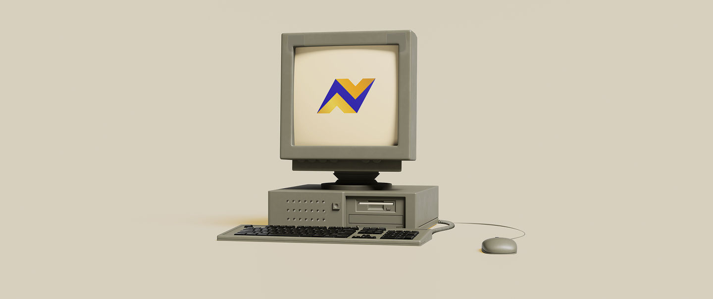
We crafted the logo for Pointables to be more than just a mark—it's a movement. Clean lines, bold presence, and
a hint of playfulness reflect the brand's mission to simplify action and amplify ideas. It's the kind of logo
that speaks in a second but sticks for a lifetime—just like the brand itself. Designed in-house, powered by
intention.

 1.png)


.png?updatedAt=1761288662903)

.svg)